简介
元素详解
根元素
layoutId 布局id
layoutType 布局id关键字
布局元素
relativelayout 相对布局
linearlayout 线性布局
控件元素
text 文本控件
img 图片控件
button 按钮控件
属性详解
共有属性
id 唯一标识符
width 宽度
height 高度
padding 内边距
margin 外边距
background 背景
visible 是否可见
onClick 点击事件监听
父元素为relativelayout的特有属性
float 相对于父元素的位置
relation 相对于兄弟元素的位置
linearlayout的特有属性
gravity 内容对齐方式
orientation 子元素排列方式
父元素为linearlayout的特有属性
weight 权重
text和button的特有属性
text 文本
textSize 文本字体大小
textColor 文本字体颜色
maxLines 文本最大行数
img的特有属性
src 图片资源路径
scaleType 图片填充方式
uexNBListView封装了自定义布局的功能,开发者可通过该插件实现原生布局.开发者根据本文档介绍的规则编写xml文件,将文件地址直接传入对应接口即可生成相应的原生布局。
xml文件有两种类型元素组成,布局和控件。布局分为相对布局和线性布局两种(具体用法后文会详述),控件分为文本,按钮和图片。布局元素旨在描述子元素的排列方式;控件则承载具体可见的内容(如文字,按钮等)。布局可嵌套,其子元素可以是布局也可以是控件。控件不能嵌套,并且没有子元素,父元素必须是布局。一个正确的xml文件的根元素必须是布局,而且至少包含一个控件。。
该元素是整个布局的根元素,任何布局都需要有该元素,该元素用于指定当前布局的唯一标识符id。属性包含layoutId和layoutType.
该属性指定当前布局的唯一标识符id,任何布局都必须定义该属性,否则视为无效。
该属性用于开发者自定义布局id的关键字。具体用法请参考API文档中setItems示例。
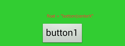
相对布局的子元素会根据它们所设置的参照元素和参数进行相对布局。参照元素可以是父元素,也可以是其它子元素,但是被参照的元素必须要在参照它的元素之前定义。如下面的xml布局代码:
<?xml version="1.0" encoding="utf-8"?>
<root layoutId = "1">
    <relativelayout width = "800" height = "-2" padding="5" background = "#32CD32">
        <button id = "button1" width = "-2" height = "-2" text="button1" float = "right"/>
        <button id = "button2" width = "-2" height = "-2" text="button2" relation = "leftOf,button1;"/>
    </relativelayout>
</root>
该布局的效果图为:

其中根元素为相对布局,button1通过float属性设置相对于父布局的位置(右对齐)。button2通过relation属性设置相对于button1的位置(在button1的左边)。其中float和relation属性含义后文详述。
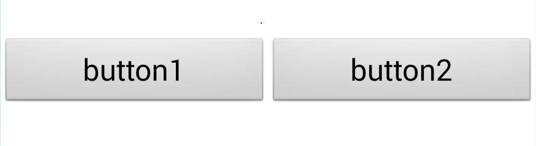
在一个方向上(垂直或水平)对齐所有子元素,一个垂直的线性布局每行将只有一个子元素(无论它们有多宽),一个水平的线性布局只是一列的高度(若该布局没有限定高度,则其高度由最高子元素的高度来填充)。如下面的xml布局代码:
<?xml version="1.0" encoding="utf-8"?>
<root layoutId = "1">
    <linearlayout width = "800" height = "-2" padding="5" background = "#32CD32" orientation = "horizontal">
        <button id = "button1" width = "-2" height = "-2" text="button1"/>
        <button id = "button2" width = "-2" height = "-2" text="button2"/>
    </linearlayout>
</root>
该布局的效果图为:

其中根元素为线性布局,并且通过orientation属性来指定所有子元素的对齐方向。该例中指定为水平方向对齐,则其子元素button1,button2依次排成一行。其中orientation属性含义后文详述。
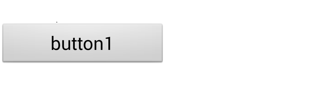
文本控件只单纯的显示一行或多行文本。如下面的xml布局代码:
<?xml version="1.0" encoding="utf-8"?>
<root layoutId = "1">
    <linearlayout width = "800" height = "-2" padding="5" background = "#32CD32" orientation = "horizontal">
        <text width = "-2" height = "-2" text = "我是text文本控件。" textColor= "#ffffff"/>
    </linearlayout>
</root>
该布局的效果图为:

图片控件显示图片资源,资源可以是本地的(res://协议路径),也可以是网络图片(http://)。需要通过`src`属性指定图片源。如要显示如下图所示的图片src.png,将该图片拷贝到appcan工程的wgtRes目录下。

然后使用如下xml代码:
<?xml version="1.0" encoding="utf-8"?>
<root layoutId = "1">
    <linearlayout width = "800" height = "-2" padding="5" background = "#32CD32" orientation = "horizontal">
        <img width = "100" height = "100" src = "res://src.png"/>
    </linearlayout>
</root>
该布局的效果图为:

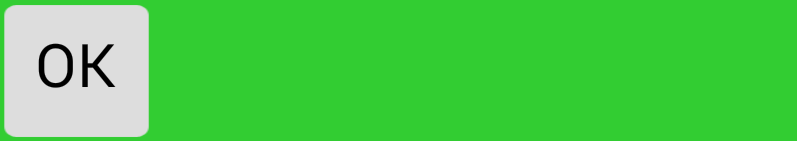
按钮控件一般由背景图片和按钮文本组成。通过background属性来设置背景图片,通过text属性来设置按钮文本。如背景图片如下图所示button_bg.png,将该图片拷贝到appcan工程的wgtRes目录下。

使用如下xm代码:
<?xml version="1.0" encoding="utf-8"?>
<root layoutId = "1">
    <linearlayout width = "800" height = "-2" padding="5" background = "#32CD32" orientation = "horizontal">
        <button id = "button1" width = "-2" height = "-2" text="OK" background = "res://button_bg.png"/>
    </linearlayout>
</root>
该布局的效果图为:
所有元素共有的属性包含:id,width,height,padding,margin,background,onClick。分别介绍如下:
说明: 元素的唯一标识符,该属性为可选项。
取值范围: 任意字符串
示例:
id = "button1"
说明: 元素的宽度。
取值范围:
1、正整数值,1,2,3,...
2、-1。完全填充父布局宽度。若该元素为根元素,则填充整个屏幕宽度。
3、-2。自适应宽度,元素的高度自适应内容宽度。
示例:
width = "-1" (适应父布局宽度)
width = "300" (具体数值)
width = "-2" (适应内容宽度)
说明: 元素的高度。
取值范围:
1、正整数值,1,2,3,...
2、-1。完全填充父布局高度。若该元素为根元素,则填充整个屏幕高度。
3、-2。自适应高度,元素的高度自适应内容高度。
示例:
height = "-1" (适应父布局高度)
height = "300" (具体数值)
height = "-2" (适应内容高度)
说明:
元素的内边距。
取值范围:
正整数值。分以下三种样式:
1、"x"。左上右下内边距都为x;
2、"x y",空格分隔。左右内边距为x,上下内边距为y;
3、"x y z w",空格分隔。左内边距为x,上内边距为y,右内边距为z,下内边距为w。
示例:
padding = "20" (左,上,右,下内边距均为20)
padding = "10 20" (左右内边距为10,上下内边距为20)
padding = "5 8 10 20" (左内边距5,上内边距8,右内边距10,下内边距20)
说明: 元素的外边距。
取值范围:
正整数值。分以下三种样式:
1、"x"。左上右下外边距都为x;
2、"x y",空格分隔。左右外边距为x,上下外边距为y;
3、"x y z w",空格分隔。左外边距为x,上外边距为y,右外边距为z,下外边距为w。
示例:
margin = "20" (左,上,右,下外边距均为20)
margin = "10 20" (左右外边距为10,上下外边距为20)
margin = "5 8 10 20" (左外边距5,上外边距8,右外边距10,下外边距20)
说明:
元素的背景,可以分为背景图片和背景色。注意背景图片仅支持本地图片,不支持网络图片。
取值范围:
分两种情况。
1、以
#开头的颜色值,如"#ffffff";2、本地图片路径,如"res://bg.png"。
示例:
background = "#32CD32"
background = "res://bg.png"
说明:
当前控件是否可见。默认为可见并占位。
取值范围:
0:可见并占位;
1:不可见但占位;
示例:
如下布局:
<?xml version="1.0" encoding="utf-8"?>
<root layoutId = "2">
    <linearlayout id = "content" orientation = "horizontal" width = "-1"  height = "300" background="#ffffff" gravity = "centerY">
        <button id = "btn1" width = "-2" height = "-2" text="button1" weight = "1"/>
        <button id = "btn2" width = "-2" height = "-2" text="button2" weight = "1"
            visible = "0"/>
    </linearlayout>
</root>
如上布局文件中定义了id为btn2的button控件的visible属性。
当visible为0时,显示效果为:
当visible为1时,显示效果为:
如上所示,button1和button2通过weight属性设置平分父布局,当设置button2的visible属性为0即显示并占位时,可看出button1和button2都显示,并且两控件宽度各占一半。
当visible属性为1,不显示但占位时,button2即为不可见,但是实际上button2继续占位,占位的效果即是继续按布局文件中的布局规则给button2控件分配空间,于是button1的显示效果和visible为0时是没有任何区别的。
说明: 在元素被点击时,若设置了该属性,网页端即可收到相应的回调。
取值范围: 取值为方法名称,该方法需要在网页端注册。具体使用如下示例
示例:
xml文件中给某个元素设置onClick属性如下:
onClick = "onClickFunc"
则需要在调用自定义布局的html网页代码中添加如下注册:(这里需要注意的是,注册的时候需要和插件相关联,下例中的uexXX即表示当前的插件名称)
window.uexOnload = function(type){
    uexXX.onClickFunc = onClickFunc;
}
function onClickFunc(data){
    alert("我被点击了!!!具体信息为:" + data);//data的数据结构不固定,具体需要参见对应插件的介绍。
}
当父元素为relativelayout时,所有的元素都支持float和relation属性。
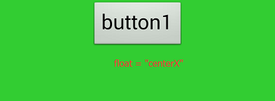
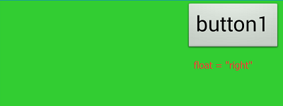
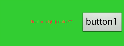
说明: 当前元素相对于父元素的位置,若未定义该属性,则默认在父元素的左上方,即"left|top"。
取值范围:
{left, right, top, bottom, center, centerX, centerY},可组合使用,用"|"分隔。这里定义水平方向位置的值为left,right,centerX。这些值相互间不能组合使用,比如不能"left|centerX"。定义垂直方向位置的值为top,bottom,centerY,同样的这些值相互间也不能组合使用。只能水平方向值和垂直方向值组合使用,如"right|bottom",而center只能单独使用,不能与其他值组合,否则会有冲突。
示例:


说明:
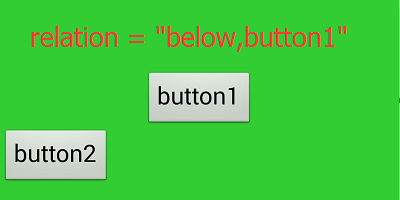
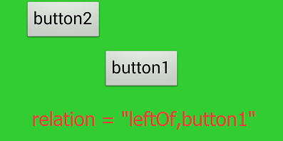
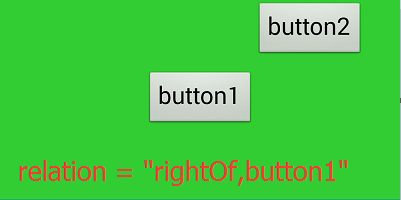
该属性定义同级的两个元素之间的相对位置。当前元素的参照元素需要提前定义,并且要定义唯一标识符id属性。
取值范围:
该属性值的写法为:relation = "相对位置,参照元素id"。注意相对位置和参照元素id之间用英文逗号,分隔。
其中相对位置的取值范围为:{leftOf, rightOf, above, below};
参照元素需要提前定义,并且定义id属性。如下示例:
<?xml version="1.0" encoding="utf-8"?>
<root layoutId = "1">
    <relativelayout width = "1000" height = "500" padding="5" background = "#32CD32">
        <button id = "button1" width = "-2" height = "-2" text="button1" float = "center"/>
        <button id = "button2" width = "-2" height = "-2" text="button2" relation = "rightOf,button1"/>
    </relativelayout>
</root>
其中id为button2的元素即是包含relation属性的当前元素,其参照元素是id为button1的元素。于是该属性的写法为:
relation = "rightOf,button1"
示例:

线性布局特有的属性有gravity和orientation。
说明:
该属性定义线性布局中的内容的对齐方式,若未定义该属性,则默认为左上方对齐。
取值范围:
{left,centerX,right,top,centerY,bottom}。此处暂不支持组合使用。
示例:
如下xml示例代码:
<?xml version="1.0" encoding="utf-8"?>
<root layoutId = "1">
    <linearlayout width = "1000" height = "500" padding="5" background = "#32CD32"
                  orientation = "horizontal" gravity = "right">
        <button id = "button1" width = "-2" height = "-2" text="button1"/>
        <button id = "button2" width = "-2" height = "-2" text="button2"/>
    </linearlayout>
</root>
显示效果为:
说明: 该属性定义线性布局中的子元素排列方式,若未定义该属性,则默认为垂直方向对齐,即显示一列。
取值范围:
{
horizontal,vertical}。
horizontal水平排列方式,所有的子元素显示为一行;
vertical垂直排列方式,所有的子元素显示为一列。
示例: 如下xml示例代码:
<?xml version="1.0" encoding="utf-8"?>
<root layoutId = "1">
    <linearlayout width = "1000" height = "500" padding="5" background = "#32CD32"
                  orientation = "horizontal" gravity = "centerY">
        <linearlayout width = "-2" height = "-1" padding="5" background = "#ffffff"
                      gravity = "centerY">
            <button width = "-2" height = "-2" text="button1"/>
            <button width = "-2" height = "-2" text="button2"/>
        </linearlayout>
        <button width = "-2" height = "-2" text="button3"/>
        <button width = "-2" height = "-2" text="button4"/>
    </linearlayout>
</root>
显示效果为:

父元素为线性布局时,其特有的属性是weight。
说明:
当父元素为线性布局时,可通过该属性来设置当前元素在所有兄弟元素中所占的比重。当父元素的orientation属性为horizontal时,设置了该属性的元素的width属性就会失效。宽度是由父元素和权重来决定的。同理,父元素的orientation属性为vertical时,设置了该属性的元素的height属性就会失效。高度是由父元素和权重来决定的。
取值范围:
正整数
示例:
示例1:
<?xml version="1.0" encoding="utf-8"?>
<root layoutId = "1">
    <linearlayout id = "ll1" width = "1000" height = "500" padding="5" background = "#32CD32"
                  orientation = "horizontal" gravity = "centerY">
        <linearlayout id = "ll2" width = "-2" height = "-1" padding="5" background = "#ffffff"
                      gravity = "centerY" weight = "2">
            <button id = "btn1" width = "-2" height = "-2" text="button1"/>
            <button id = "btn2" width = "-2" height = "-2" text="button2"/>
        </linearlayout>
        <button id = "btn3" width = "-2" height = "-2" text="button3" weight = "2"/>
        <button id = "btn4" width = "-2" height = "-2" text="button4" weight = "1"/>
    </linearlayout>
</root>
如上代码所示,id为ll1的线性布局的orientation属性为horizontal,其子元素分别为ll2,btn3,btn4。分别设置其weight值为2,2,1。则显示效果为:
如图可知,设置了weight值的元素的宽度即是父布局的宽度乘以权重比。权重比的计算方法为:权重值除以总权重值。即ll2的宽度为父元素宽度的2/5。
示例2:
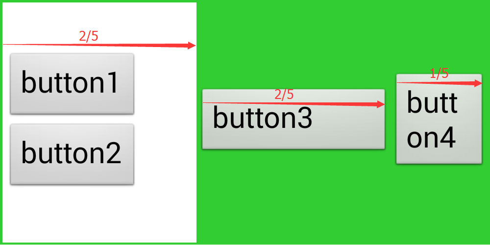
<?xml version="1.0" encoding="utf-8"?>
<root layoutId = "1">
    <linearlayout id = "ll1" width = "1000" height = "500" padding="5" background = "#32CD32"
                  orientation = "horizontal" gravity = "centerY">
        <linearlayout id = "ll2" width = "-2" height = "-1" padding="5" background = "#ffffff"
                      gravity = "centerY" weight = "2">
            <button id = "btn1" width = "-2" height = "-2" text="button1"/>
            <button id = "btn2" width = "-2" height = "-2" text="button2"/>
        </linearlayout>
        <button id = "btn3" width = "-2" height = "-2" text="button3"/>
        <button id = "btn4" width = "-2" height = "-2" text="button4" weight = "1"/>
    </linearlayout>
</root>
如上代码所示,ll1的子元素中只有ll2和btn4设置了weight属性。显示效果如下:
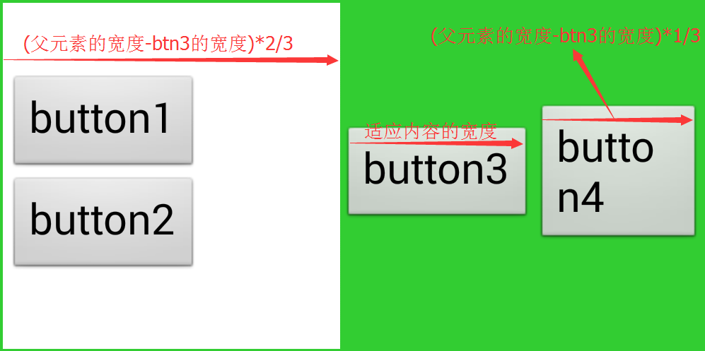
如图可知,未设置weight属性的,宽度以width属性值为准。其余设置了weight属性的子元素根据权重比来计算宽度。注意在计算权重比的时候,总宽度已经不是父布局的宽度,而是父布局的宽度减去未设置weight属性的元素的宽度。
示例3:
<?xml version="1.0" encoding="utf-8"?>
<root layoutId = "1">
    <linearlayout id = "ll1" width = "1000" height = "500" padding="5" background = "#32CD32"
                  orientation = "horizontal" gravity = "centerY">
        <linearlayout id = "ll2" width = "-2" height = "-1" padding="5" background = "#ffffff"
                      gravity = "centerY" weight = "1">
            <button id = "btn1" width = "-2" height = "-2" text="button1" weight = "1"/>
            <button id = "btn2" width = "-2" height = "-2" text="button2" weight = "1"/>
        </linearlayout>
        <button id = "btn3" width = "-2" height = "-2" text="button3"/>
        <button id = "btn4" width = "-2" height = "-2" text="button4"/>
    </linearlayout>
</root>
如上代码所示,所有子元素中只有一个元素ll2设置了weight属性,无论该值为多少,ll2的宽度都是父元素的宽度减去btn3,再减去btn4的宽度。显示效果如下:

text和button元素特有的属性为:text,textSize,textColor,maxLines。
说明: text或button控件元素显示的文本。
取值范围: 任意字符串
示例:
text = "我是内容"
说明: text或button控件元素显示的文本字体大小。
取值范围: 正整数
示例:
textSize = "20"
说明: text或button控件元素显示的文本字体颜色。
取值范围:
以#号开头的颜色值。
示例:
textColor = "#ff0000"
说明: text或button控件元素显示的文本最大行数。
取值范围: 正整数值
示例:
<?xml version="1.0" encoding="utf-8"?>
<root layoutId = "1">
    <linearlayout width = "800" height = "-2" padding="5" background = "#32CD32" orientation = "horizontal">
        <text id = "txt" width = "200" height = "-2" text = "我是文本控件" textColor= "#ffffff"/>
    </linearlayout>
</root>
如上代码所示,固定id为txt的元素的宽度为200,文本内容较多时,会自动显示多行。效果如图:

此时若想只显示一行,可设置maxLines属性。如下:
<?xml version="1.0" encoding="utf-8"?>
<root layoutId = "1">
    <linearlayout width = "800" height = "-2" padding="5" background = "#32CD32" orientation = "horizontal">
        <text id = "txt" width = "200" height = "-2" text = "我是文本控件" textColor= "#ffffff" maxLines = "1"/>
    </linearlayout>
</root>
效果如图:

img元素的特有属性包括src和scaleType
说明:
图片资源路径包括本地路径和网络路径。
取值范围: 本地路径和网络路径
示例:
src = "res://src.png"
说明: 图片填充方式。
取值范围:
{fitXY, center, centerCrop, centerInside}
fitXY横纵独立缩放,填充满整个控件
center按原图大小显示图片,当图片宽高大于控件的宽高时,截取图片中间部分显示
centerCrop按比例放大原图直至完全填充整个控件
centerInside当原图宽高小于或等于View的宽高时,按原图大小居中显示;反之将原图缩放至View的宽高居中显示
示例: 该例中用到的图片是在img控件元素例子中用到的src.png,其宽高为164*164。 示例1:
<?xml version="1.0" encoding="utf-8"?>
<root layoutId = "1">
    <linearlayout width = "800" height = "-2" background = "#32CD32">
        <img width = "200" height = "200" src = "res://src.png" scaleType = "fitXY"
             background = "#0000ff"/>
    </linearlayout>
</root>
运行效果为:

示例2:
<?xml version="1.0" encoding="utf-8"?>
<root layoutId = "1">
    <linearlayout width = "800" height = "-2" background = "#32CD32">
        <img width = "200" height = "200" src = "res://src.png" scaleType = "center"
             background = "#0000ff"/>
    </linearlayout>
</root>
运行效果为:

示例3:
<?xml version="1.0" encoding="utf-8"?>
<root layoutId = "1">
    <linearlayout width = "800" height = "-2" background = "#32CD32">
        <img width = "145" height = "145" src = "res://src.png" scaleType = "center"
             background = "#0000ff"/>
    </linearlayout>
</root>
运行效果为:

示例4:
<?xml version="1.0" encoding="utf-8"?>
<root layoutId = "1">
    <linearlayout width = "800" height = "-2" background = "#32CD32">
        <img width = "170" height = "190" src = "res://src.png" scaleType = "centerCrop"
             background = "#0000ff"/>
    </linearlayout>
</root>
运行效果为:

示例5:
<?xml version="1.0" encoding="utf-8"?>
<root layoutId = "1">
    <linearlayout width = "800" height = "-2" background = "#32CD32">
        <img width = "150" height = "190" src = "res://src.png" scaleType = "centerInside"
             background = "#0000ff"/>
    </linearlayout>
</root>
运行效果为:

示例6:
<?xml version="1.0" encoding="utf-8"?>
<root layoutId = "1">
    <linearlayout width = "800" height = "-2" background = "#32CD32">
        <img width = "170" height = "190" src = "res://src.png" scaleType = "centerInside"
             background = "#0000ff"/>
    </linearlayout>
</root>
运行效果为:

2015-10-08 初始版本
 400-040-1766
 服务邮箱:service@zymobi.com
。需要通过`src`属性指定图片源。如要显示如下图所示的图片src.png,将该图片拷贝到appcan工程的wgtRes目录下。)